Crypto trading
Volume Profile: POC, VAH and VAL Explained with Numbers
A volume profile turns a familiar chart question around. Instead of asking how much traded during each minute, it asks where trading activity accumulated across price. The result can look impressively precise: a point of control, two value-area boundaries and several thick or thin zones. Precision on the screen, however, is not the same as a reliable trading instruction.
This guide builds a small profile that you can calculate by hand, then shows how to turn it into a repeatable research process. The figures are invented teaching data, not a market forecast or New Hope performance result.
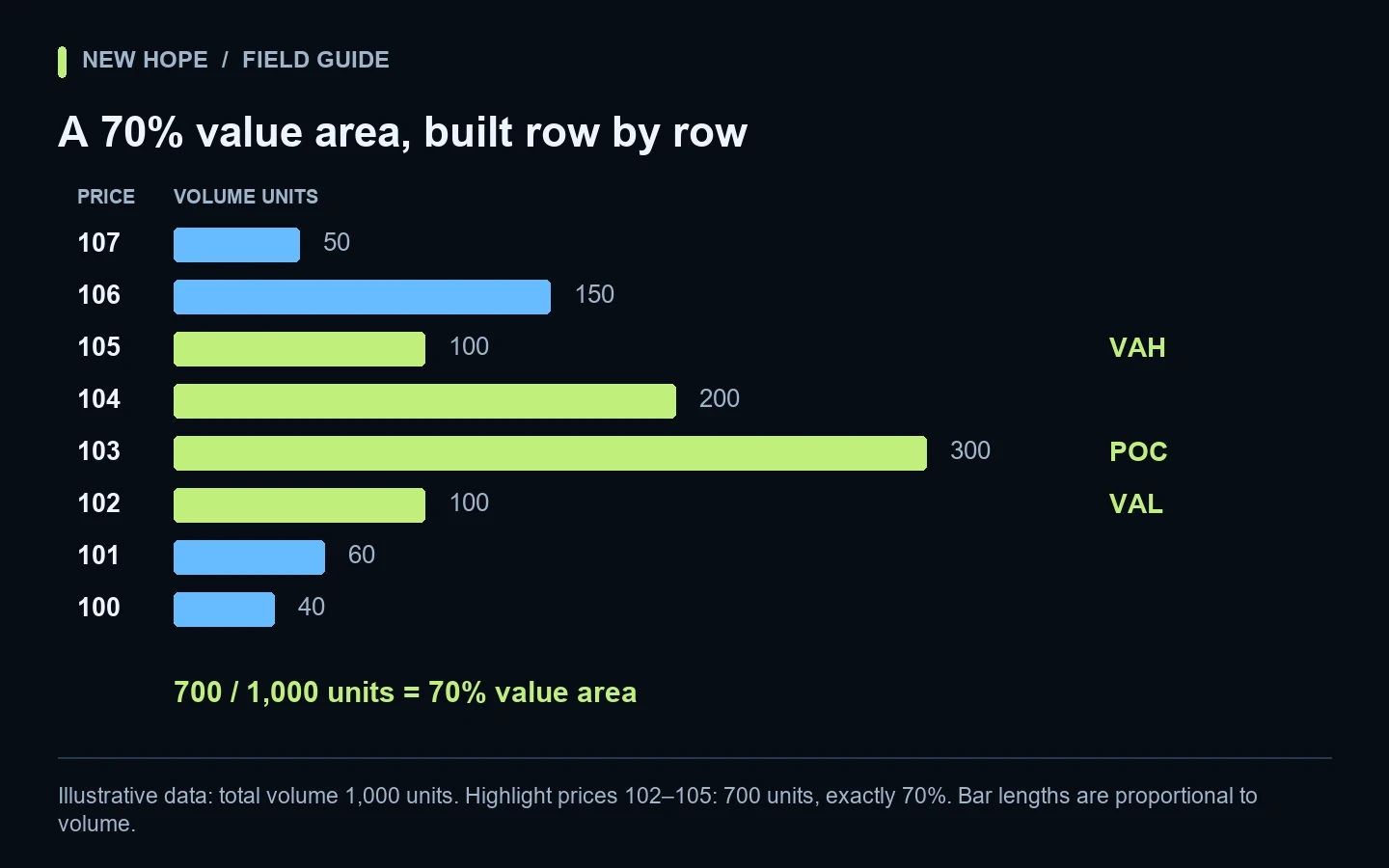
Illustrative data: total volume 1,000 units. Highlight prices 102–105: 700 units, exactly 70%. Bar lengths are proportional to volume.
What POC, VAH and VAL actually describe
The point of control (POC) is the row with the most volume in the selected profile. The value area contains a chosen share of volume; 70% is a common setting. VAL and VAH are its lower and upper boundaries. These labels describe a historical distribution, not guaranteed support or resistance. See TradingView’s definitions and calculation method.
Think of a busy railway station. A platform that handled many passengers yesterday tells you where activity concentrated. It does not tell you which platform will be busy tomorrow. Similarly, a large volume node identifies participation during a particular sample. You still need a separate, testable rule for what happens when price revisits it.
A worked profile: find all three levels
Imagine eight equally spaced price rows. Each row represents the same price width, and the volume unit is consistent throughout. We deliberately choose uncomplicated numbers so you can reproduce the arithmetic without specialist software.
Price row | Volume units | Share of total | Final label |
|---|---|---|---|
107 | 50 | 5% | Outside value area |
106 | 150 | 15% | Outside value area |
105 | 100 | 10% | VAH |
104 | 200 | 20% | Inside value area |
103 | 300 | 30% | POC |
102 | 100 | 10% | VAL |
101 | 60 | 6% | Outside value area |
100 | 40 | 4% | Outside value area |
The total is 1,000 units. A 70% target is therefore 700 units. Start with row 103, which contains 300 units and is the POC. Compare the adjacent rows: 104 contains 200 units and 102 contains 100. Add 104, bringing the running total to 500.
The next candidates are 105 and 102, both with 100 units. In this illustration, use the nearer-to-POC tie rule: row 102 is one step away and row 105 is two steps away. Add 102 to reach 600. Now compare 105, with 100 units, against 101, with 60. Add 105 and reach exactly 700.
The completed value area is 102–105, with POC at 103. Notice that row 106 contains more volume than row 105 yet remains outside. We expanded a contiguous area from the POC rather than simply choosing the four largest rows anywhere in the chart. That difference is a useful sanity check when comparing platforms.
What if the target falls between rows?
Real profiles rarely produce such neat arithmetic. A final row may take the total past the percentage target. Platforms can differ in expansion rules, tie handling and boundary conventions. Document the implementation you use; do not manually force two different indicators to agree by moving the lines. The point of this exercise is reproducibility, not an insistence that every chart must return our example’s exact procedure.
Four settings that change the answer
1. The start and end of the sample
A profile covering a quiet morning answers a different question from one covering a whole week. For a 24-hour crypto market, define your session boundary explicitly, such as 00:00–23:59 UTC. Record it in the research sheet. Session tools can divide activity by specified sessions, as described in TradingView’s session-profile documentation.
Our practical suggestion is to compare two predetermined windows, not keep dragging the start point until a historical trade looks attractive. Save both results, including the one that does not fit your initial idea. Otherwise the attractive level may be a product of your selection rather than a repeatable feature of the market.
2. Row width
Suppose you merge our rows into pairs. Prices 102 and 103 now form one 400-unit bucket; prices 104 and 105 form a 300-unit bucket. You have changed the resolution and the apparent shape. A wider bucket also makes a label less precise. Record a level as a zone with its actual boundaries when the strategy needs that distinction.
3. The data underneath the picture
A calculation built from aggregated bars can differ from one constructed from individual trades. TradingView documents lower-timeframe selection for its Periodic Volume Profile. For your own comparison, keep the venue, symbol, market type and sample constant before blaming the indicator. A spot pair and a perpetual contract are different datasets.
Our separate guide to tick data versus candle data explains why a candle’s summary cannot describe every event inside it. Also read volume profile versus order book before treating historical traded volume as current resting liquidity.
4. Whether the profile is still developing
Imagine another 250 units trade at 106 after your screenshot. That row now holds 400 units, the total becomes 1,250, and the POC changes. The old screenshot was not necessarily wrong; it described an earlier sample. A research log should distinguish a frozen previous-session profile from a developing current-session profile.
Turn a level into a question you can test
Instead of writing “buy at VAL,” define an observation protocol. For example: record the first return to the previous session’s lower value boundary; record whether price remains inside the value area for three completed one-minute bars; then measure subsequent movement over a fixed horizon. This is an illustrative research design, not an entry recommendation.
Keep entry logic separate from outcome scoring. Decide in advance how to handle repeated touches, missing data, wide spreads and overlapping observations. Include days on which no event occurs. If you remove inconvenient events after seeing their results, the remaining sample will tell a more flattering story than the process deserves.
Research field | Example entry | Why record it? |
|---|---|---|
Profile window | Previous UTC day | Makes comparisons consistent |
Reference | Frozen VAL zone | Avoids moving the target later |
Observation rule | First return only | Avoids counting one event repeatedly |
Execution assumption | Bid/ask and fees included | Separates a chart pattern from a tradable result |
Failure record | Missing trades or delayed feed | Shows data-quality exclusions |
A useful second experiment changes only the row width while keeping everything else fixed. If a small resolution adjustment completely reverses the result, investigate sensitivity before adding complexity. Compare performance across separate periods, not only across more parameters within the same historical sample.
Where the profile stops helping
A level cannot specify your order’s permitted quantity, execution price or derivatives liquidation trigger. Those are separate operational questions. Review tick size, quantity steps and minimum order value before converting a theoretical position size into an exchange order. For perpetual positions, understand mark price versus last price.
Costs deserve their own line in the experiment. Repeated small moves can look attractive before fees and disappointing afterward. Use the framework in maker and taker fees for trading bots to compare gross movement with realistic execution costs.
A practical profile checklist
Name the exchange, symbol and spot or derivatives market.
Fix the timezone, sample boundaries and volume units.
Record row width, value-area percentage and indicator implementation.
Mark each reference as frozen or developing.
Save the underlying observations, not only a screenshot.
Separate research rules, position sizing and execution checks.
Retain failed examples and test a later period independently.
Common questions
Does a 70% value area contain 70% of future price movement?
No. It describes a share of the volume in the selected historical sample. It is not a probability that the next trade succeeds or that price remains inside the boundaries.
Is the POC the same as VWAP?
No. POC identifies the busiest price row. A volume-weighted average combines prices and volumes into an average. A dataset can have the same average and a very different distribution, so the two measurements serve different descriptive purposes.
Can an AI strategy use volume profile automatically?
It can use volume-related inputs as part of defined rules, but the word AI does not specify the formula or remove execution risk. New Hope Crypto combines volume-profile analysis, price-level clustering and price movement in its automated strategy. Discuss the intended exchange, instrument and operating setup with the team; this educational calculation is not a disclosure of the proprietary VP2 model.
More articles